Hello my loves,
How are you all? I hope December’s treating you gently, that you’re lighting candles, decorating your Christmas tree, wrapping up warm, and maybe finding little moments of calm between the chaos.
I’ve been spending a lot of time this month reflecting on how our homes evolve with us, and this week, Pantone gave me the perfect excuse to talk about something very dear to my heart: the power of a perfect neutral.
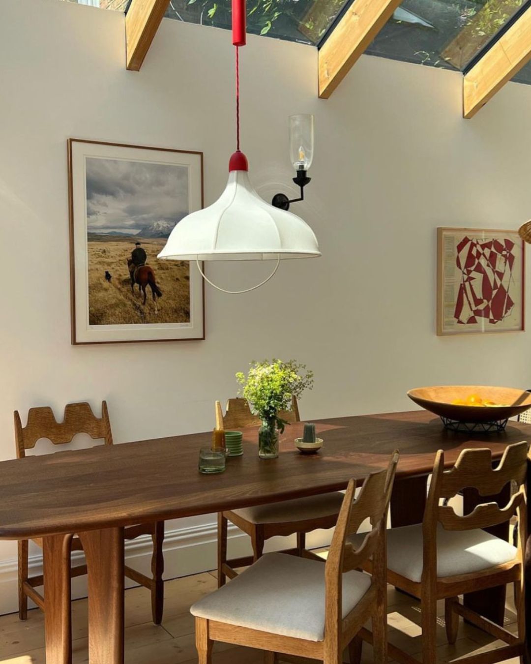
I’ve packed this week’s newsletter with imagery to hopefully provide some neutral inspiration for you, too.

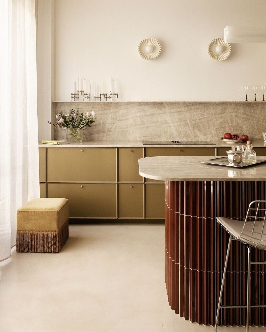
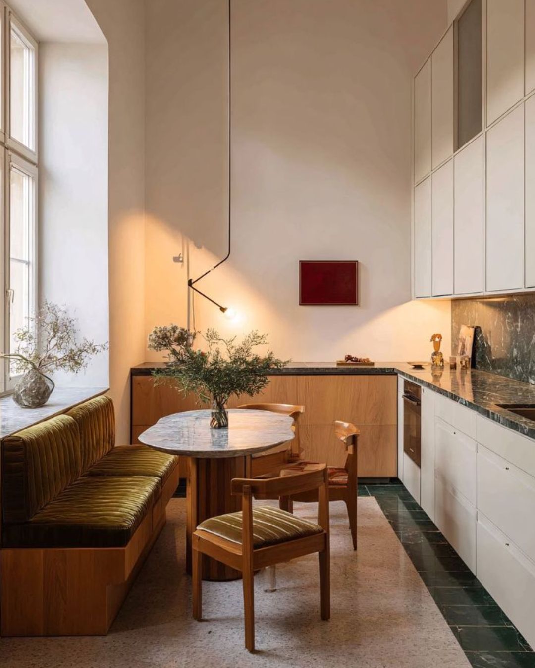

The importance of the perfect neutral
With Pantone naming Cloud Dancer as their Colour of the Year for 2026, a balanced, quietly elegant white that’s already setting the design world alight, I found myself smiling. Because if you’ve ever had a colour consultation with me, you’ll know how often this conversation comes up.
Your home should tell your story. And through nearly 7,000 consultations now, I’ve seen the most incredible shift: people are braver than ever. Rich, emotional colours; joyful artwork; rooms that make you feel. I love watching homes evolve into spaces that are deeply personal and unapologetically expressive.
But here’s the thing, even the boldest home needs a heartbeat.
That’s what the perfect neutral provides.


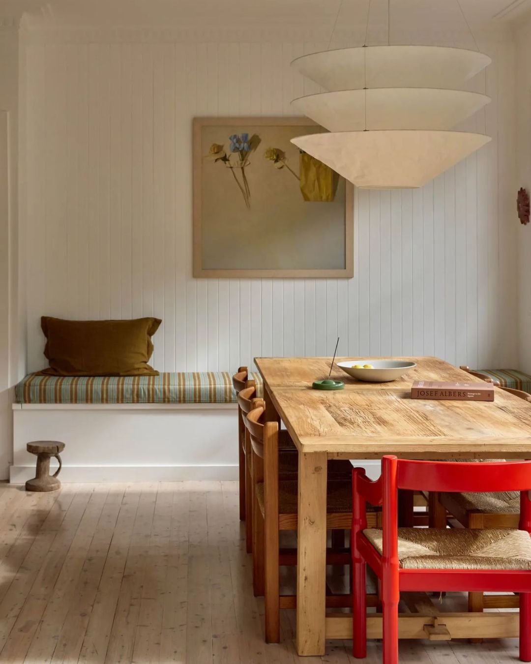


Why neutrals matter deeply
A well-chosen neutral doesn’t quiet your story; it grounds it. It’s the backdrop that lets every other colour shine. It gives the eye a place to rest while letting contrast and emotion breathe through the rest of your space.
I like to think of neutrals as the connective tissue of a home, the element that ties together all those smaller design moments. You can run it across ceilings, join spaces with consistency, soften bolder tones, and bring a sense of calm that still feels alive.
That’s why Cloud Dancer feels so right: warm but never creamy, fresh but never cold. For real-world examples, my go-to from the Lick palette is White 05, it’s endlessly balanced, beautifully adaptable, and works magic in any direction or style of home.
But remember, your “perfect neutral” might not be white at all. It might be that soft, grounding taupe; a warm beige that weaves its way through your lampshades, curtains, and cushions; or a gentle greige that hums quietly beside deeper colours. What matters most is that it supports your home’s soul, never shouting, always whispering.
Because when your neutral finds its place, everything else starts to sing.


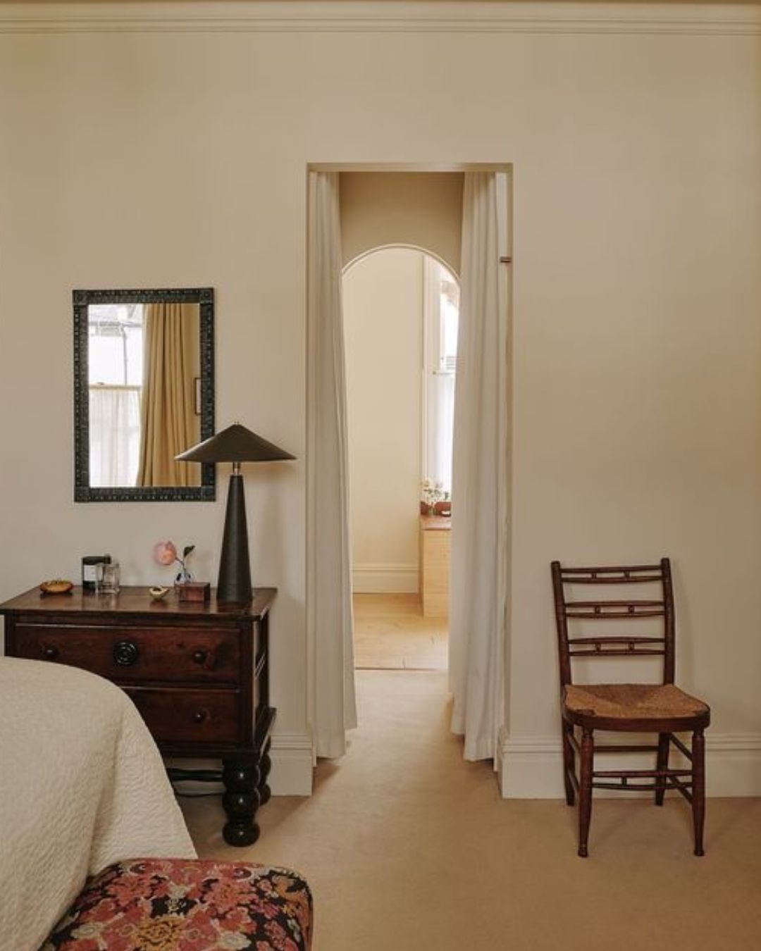
How to identify your perfect neutral
So where should you start? The best place is right there, in your own home.
Look around at the colours you naturally gravitate towards, the ones that keep showing up in your furniture, artwork, textiles, or even the clothes you wear most often. Your perfect neutral should complement those.
If your home leans towards pinks, burgundies, or soft earthy tones, then turn to neutrals with a pink or red undertone. Think whites or taupes and browns that carry that subtle pink base, they’ll harmonise beautifully and make everything feel coherent.
If you find yourself drawn to greens, a white with a yellow undertone will act as a perfect partner, bringing balance and quiet warmth.
This approach means you can embrace those richer, bolder colours without hesitation, knowing your neutral is confidently working behind the scenes, connecting your home seamlessly and with intention.

Before I go, a quick announcement: if you loved my How To Decorate Your Living Room course, I have another course launching very soon, and I couldn’t be more excited to share what’s coming next. Keep an eye on your inbox… you’ll be the first to know.
Until next time,
Tash x
All images from Pinterest
